If your users have to pay attention to your interface, there’s something wrong with it. Your interface should be invisible, not obvious.
Consider the ubiquitous office-building door. As you are leaving the office building, you approach the door and instinctively grab the handle, pulling it to open the door. But to your shock and dismay, the door doesn’t open.
Then you see it, the little sign above the handle that says PUSH. You feel like an idiot because you can’t open something as simple as a door.
The design of that door interrupts the users’ task and creates a negative experience. If something as simple as a door requires instructions, there’s something inherently wrong with the design.
A door should not require users to pay attention to it in order to use it. Instead of a handle, a better design uses a flat panel on the door, which invites only one action, the correct one, to push.
With a panel instead of a handle, you push the door open and walk out without giving the door a second thought. The flat panel makes the door “invisible.”
You Can’t Design ‘Delight’
I’ve heard so many people say they want their design to delight the user. While it sounds good, you can’t actually design “delight.”
A door with a panel will not delight you, but it won’t interrupt you or create a negative experience, either. It is, essentially… invisible.
Though you can’t design “delight,” you can design interfaces that avoid negative experiences and help the users complete their task with a minimum of effort, thus creating a sense of “delight.”
Ex: Selecting Shipping Methods
Consider the ubiquitous shipping method selection in a typical ecommerce site. You’ve seen a thousand of them, but I’ve only found one that does it correctly.
How many times have you had to stop and think about which method to use and wondered exactly what day your package would arrive. Must of that confusion lies in the terminology they use to describe the choices, such as 3–4 business days. You probably wondered if that included Saturday, since the delivery companies operate on Saturdays.
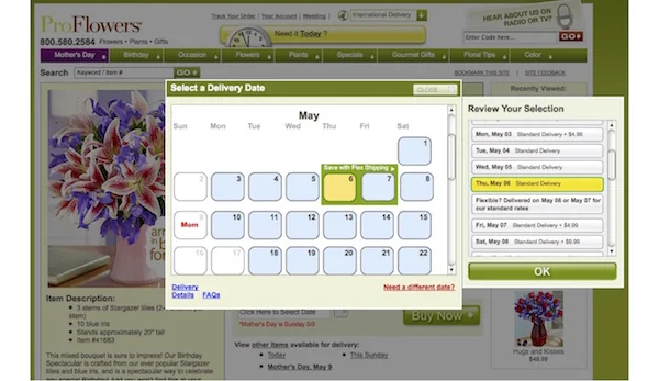
ProFlowers eliminates the confusion by offering a calendar and asking users to select the day they would like the flowers to arrive. This limits the shipping choices to only those that achieve the desired delivery date. This simple change removes any doubt or confusion and makes the user feel confident that the flowers will arrive on time.
I’ve seen other methods that attempt to reduce user confusion, such as estimated delivery dates, and delivery rules for each selection, but each of these are little more than instructions on a door and none are as “invisible” as the ProFlowers approach.
How Do You Measure Invisible?
So how can you “see” something that’s invisible? Like tracking an invisible man in the snow, follow the footprints, your site analytics.
Review the page paths that typical users follow. The more times a user revisits a page, the less invisible or delightful your design is to them. If your site analytics show that users flowed directly through the site without having to revisit the same pages, then your design is more invisible.
You can also survey users to understand their perceptions about completing their task on your site. Compare their perceptions with actual results to measure the effectiveness of your design. The 2 things you can use to gauge the invisibility are:
- Perception of time: How long did users think it took to complete their task. The less time it feels like it took verses actual time, the better your design.
- Number of pages: How many pages do users recall using to complete the task. The fewer pages they recall than they actually visited.
If users complain about the number of pages or the time it took, then you’ve failed. But don’t think that fewer clicks or pages are the answer, either. The point is to design a UI where the pages become invisible. As other blog posts discuss, fewer clicks or pages are NOT the right answer. It’s really more about the right number of pages for the task.
It Takes a Practiced Eye
An unfortunate side effect of the invisibility of good UX is that, if done well, no one notices it. If they don’t notice it, they don’t value it.
I’m often asked for a portfolio of my UX designs by potential clients, many of whom who usually focus on the visual language or technical features. These clients don’t get it and I usually turn down those projects.
I used to try and educate these folks, but one thing I’ve learned after 25 years as a UX designer is never try to teach a pig to sing. It wastes your time and annoys the pig.
If, however, the client describes how easily they understand the interface or website, I know they are focusing on the right aspects of good UX design and working with them will be mutually successful (and enjoyable). Our design meetings will be about the psychology of user experience and how to make the interface “invisible,” not about what colors will “delight” the user or how many more features we can add.
On your next redesign, rather than falling prey to the common, yet ineffective, approach of striving to make your design stand out, focus, instead, on making it invisible. That’s not to say that technology and visual design are unimportant, but that there needs to be a balance between technology, visual and UI design. That delicate balance is not easy to achieve, but will launch your single digit conversion rates into the realm of double-digit successes.