There are countless articles on creating user engagement, so why another one? Well, whereas the rest focus on things that have absolutely nothing to do with the user, this article focuses on leveraging the psychological aspects of users to dramatically increase engagement.
If you follow the advice given those other articles, you might improve user engagement by .1%. Rather than discussing the obvious things common to other articles, such as decrease page load time, speak the user’s language, apply responsive design, this post describes how to make a truly dramatic impact on your users and bottom line.
If you really want to drive user engagement, try the following methods that have doubled conversion rates for almost 30 years. These methods are often interrelated, but I’ll describe them individually for clarity.
Creating Emotional Investment
Helping users create an emotional attachment to your website is one of the most successful strategies to increase user engagement. Emotional investment is simply promoting an interaction that develops some intrinsic value to the user. The following methods describe ways to promote emotional investment:
Create Something of Value
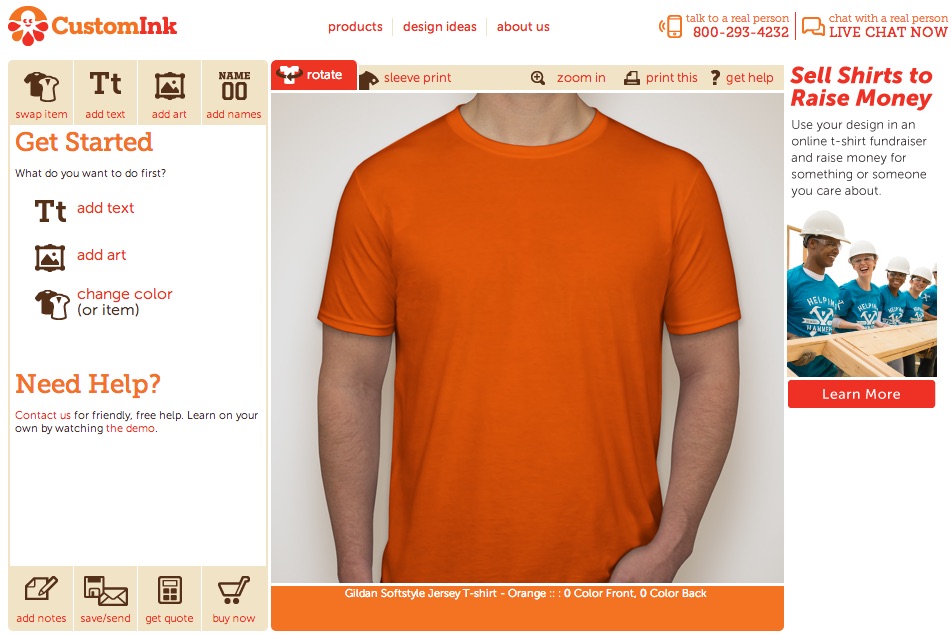
Help the user create something that has a personally intrinsic value. CustomInk.com began the users’ journey by having users select a shirt style, cloth type, and color, etc. (5 steps in total) before letting them create their custom logo. Creating a custom logo is one of the most emotionally laden opportunities and CustomInk relegated it to the last step of their process. After years of using their design as a public example of squandering an opportunity, CustomInk.com finally changed their website and put the logo design tool more up front. I’m assuming it’s an improvement since they haven’t gone back to the old way. You’re welcome CustomInk.
Give them a reason to come back
Once users create something, prompt them to save it. They are emotionally invested enough to give them a reason for returning to the site. When they do return, land them on the page where they can pick-up where they left off. Again, this was an opportunity that CustomInk missed for many years. Recently, they have included a mechanism to retrieve a design from the home page. Again, I’m sure it has worked out well for them.
Point of Pain
Users come to your site to solve a problem, a point of pain. Your site must immediately demonstrate that you understand their problem. Once you empathize with their problem, they will be more ‘connected’ to your site and look forward to the solution you offer.
If you think you know what problem your users need to solve, you are wrong. Good user research accurately defines the users’ problem, from their perspective, and it is NEVER what you think it is. If your research doesn’t identify a new problem definition, then your research is inaccurate. I’ve conducted research on over 250 projects and every one of them began with an inaccurate problem definition. If you don’t accurately know what problem you need to solve, the best you can hope to do is solve the wrong problem, very well.
Make sure you understand their problem from their perspective, not yours.
Commitment Free Interaction
A common practice on many websites is to demand valuable information, such as an email address, in exchange for something of assumed value, such as a white paper. Many users are hesitant to give out their email address out of fear that it will be used to spam them. Users are also suspicious of the “value” of the white paper. Many users abandon sites that demand personally valuable information at this point.
Users are much more likely to interact with a website that provides value without requiring a big commitment. For instance, Essurnace.com requires simple, non-personal information and provides a representative sample insurance quote. It’s not an accurate quote, but it is enough to engage the user to continue interacting with the site, eventually leading to a quote.
Micro-Interactions
Most sites are little more than electronic brochures. They rely on the users’ interest to continue clicking around the site. More often, users don’t find what they are looking for but keep clicking around in the faint hope of finding something worthwhile. Low conversion rates suggest that they are sadly disappointed.
Interestingly, each failed click creates more friction and decreases the potential to continue interacting with the site. A more successful approach is to provide some type of tool that users can interact (play) with. These subtle interactions increase the perception of value and promote continued interaction.
Another approach is to create a selection or filtering mechanism that continually refines the content to focus on the users’ problem. This repeated interaction increases the site’s relevancy and increases the attraction to the user. Users are more likely to interact with a site that improves the value proposition with each small click.
Baby Steps
Many sites are under the mistaken impression that the users will make a giant leap of faith going from undecided to fully committed on one screen and magically click that Buy Now button. Rather than hoping for that leap of faith, provide micro-interactions that mimic the typical purchase process (discover, investigate, narrow the field, and selection). In essence, guide the user through the entire process and your site will be perceived as more helpful, thus increasing the potential for conversion.
Give These Ideas a Try
These are just some of the methods I’ve used over the years to double, triple and quadruple website successes. As I mentioned, there are obvious interrelationships between some of these approaches, but I hope I was able to describe them well enough for you to try some of these on your site. If you need help, you know where to find me.