A Portfolio of SUccess
While we do conduct all forms of generative and evaluative user research, including competitive research, interviews, surveys, and usability testing, observational research remains our most successful generative method. The following list demonstrates our generative research successes.
FedEx Print Application
The Project:
Complete redesign of FedEx online print web application.
The Results:
Replaced the lackluster Brick and Mortar operation with a highly streamlined and very profitable web application. Increased profits far above projections.
How We Did It:
We were initially commissioned to conduct a quick UX evaluation of the existing incarnation of the online print application. The results of our evaluation were compelling enough for FedEx Kinko's to launch a major redesign effort.
We performed ethnographic observations with real users, which identified the root of the lackluster performance. The previous interaction design metaphor was based on a wizard approach, but our user research determined that a task-oriented interaction was more appropriate for creating and submitting print orders.
We created a new task-based, dialog driven design with enough flexibility to support complex print jobs, while at the same time gently guiding users through the process. Usability testing of early design mock-ups verified the success of the new interaction metaphor. The results exceeded even the wildest expectations of Product Management.
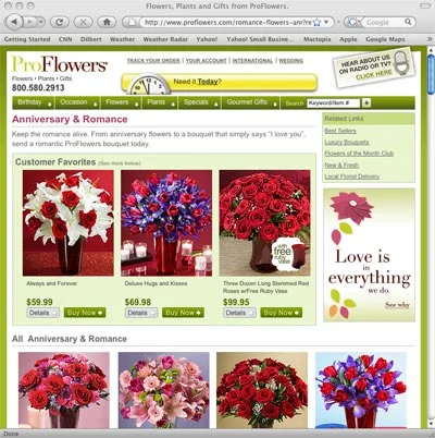
ProFlowers.com
The Objective:
One of our earliest projects is our best case study of a successful user research effort. The executives of an e-commerce site commissioned us to design a new approach to buying flowers online that would disrupt the florist market. They were surprised that our results didn’t look like anything they had seen before. Needless to say, they were skeptical.
How We Did It:
The executives initially suggested a number of key competitor websites to use for usability testing. Instead of running tests on these websites, we visited brick and mortar flower shops to observe how people bought flowers without relying on a specific technology. Remaining technology agnostic exposed the user’s cognitive processing behaviors better than watching how they struggled with a poorly designed website.
Insights:
Very quickly, it became plainly obvious why these other online florists were suffering. They were solving the wrong problem, very well. All of the existing florist sites expected their users to create bouquets. The problem was that most people buying flowers were men. What do men know about flowers? Roses, and that’s pretty much it, so any site that relied on men building bouquets was doomed to fail.
We observed that buyers performed the similar behaviors, every time. They wouldn’t ask the clerk for specific flowers, such as Lilies or Daffodils, they simply said “I forgot my wife’s birthday and need flowers to get out of the doghouse. What’s a good bouquet to say I’m sorry?” So men weren’t there for the flowers, they were there for a reason or an occasion! Our UX strategy was obvious.
Proflowers doesn’t sell flowers, they sell occasions.
Given that men know nothing about bouquets, especially knowing which bouquet is right for each occasion, we designed the site to avoid that knowledge requirement. Rather than requiring men to build bouquets, or even to know which bouquet to buy for a specific occasion, we organized the site around the occasion. Men knew WHY they need the flowers, so all they had to do was select the right occasion and they were presented with a selection of bouquets perfect for that occasion.
Outcome:
Proflowers launched their new site just in time for Valentine’s Day, 1998. A few weeks later the executives called and wanted their money back. The new site was a miserable failure!
We reviewed the new site and noted that the developers took obvious liberties with our original design. The developers admitted that our design didn’t look like any of the other florist sites so they changed the design to make the new site look just like the other sites.
The Proflowers executives were livid and told the developers to rebuild the site following our designs. The rebuilt site launched in time for Mother’s Day and has had a top-ten conversion rate every month for 20 years. 20 years! This unintended A/B comparison proves the power of good user research.